Brand Guidelines
Last updated June 11, 2025
Hjemmelegene Logo
Usage
- The logo exist as both wordmark and symbol.
- The color of the logo can only be in either positive or negative.
Wordmark


Typography
The way typography is used says as much about our brand as the words themselves.Fabriga typeface has been specially created to complement Hjemmelegene's tone of voice.
Typograhpy Structure
Lorem ipsum dolor sit amet consectetur adipiscing elit. Quisque faucibus ex sapien vitae pellentesque sem placerat. In id cursus mi pretium tellus duis convallis. Tempus leo eu aenean sed diam urna tempor. Pulvinar vivamus fringilla lacus nec metus bibendum egestas. Iaculis massa nisl malesuada lacinia integer nunc posuere. Ut hendrerit semper vel class aptent taciti sociosqu. Ad litora torquent per conubia nostra inceptos himenaeos.
Downloadable Used Fonts Files
Other Downloadable Font Weights
Brand Colors
Usage
- Use strong colors (Purple, Mint, Salmon) sparingly — for buttons, highlights, or key actions
- Backgrounds should be White, Light Purple, Lighter Purple, or Light Mint
- Purple can be used as background in moderation – avoid using Mint or Salmon as background colors for large sections
- Don’t use too many bold colors at once — keep it clean and focused
- Always ensure good contrast between text and background for readability
Photography Style
Style:
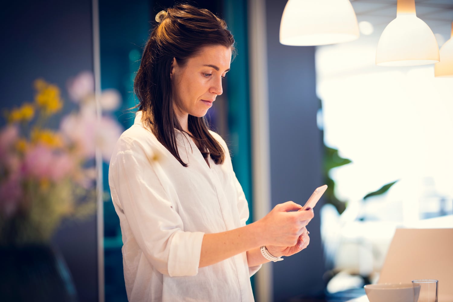
- Photography should ideally be taken at home or in a real work environment — wherever the interaction naturally takes place
- Should convey a warm, authentic and personal atmosphere — capturing real moments, not staged ones
- Use natural daylight as the primary light source to create an open and trustworthy feel
- The setting should feel lived-in and genuine, not overly polished — it should reflect real-life environments the audience can connect with
Examples




Iconography
We use our iconography when we need to explain our digital features such as getting a text and how to get appointments.
Guides for advertisements
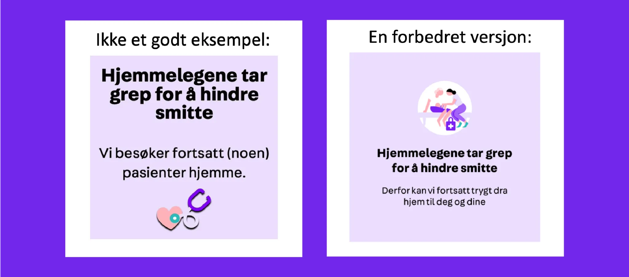
- Always use Font Fabriga Bold as title + Fabriga regular as text
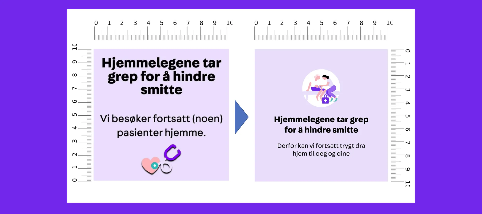
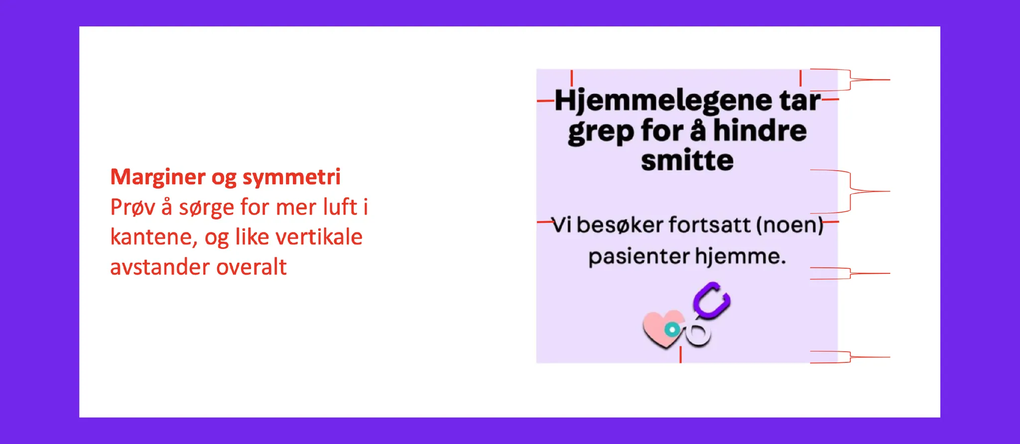
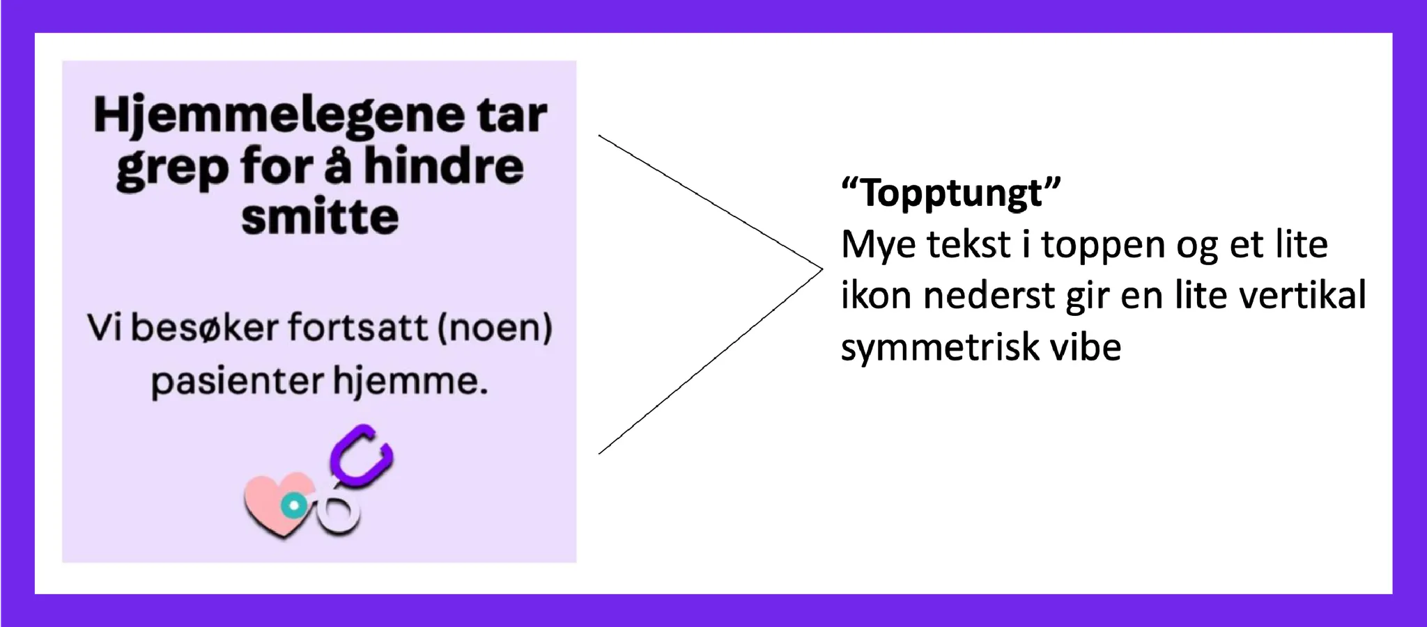
- Use mathematical symmetry or a feeling of symmetry (centered, equal distances between elements)
- Make it airy almost everywhere, give it space to breathe
- Good margins from the edges, min 15% from each edge
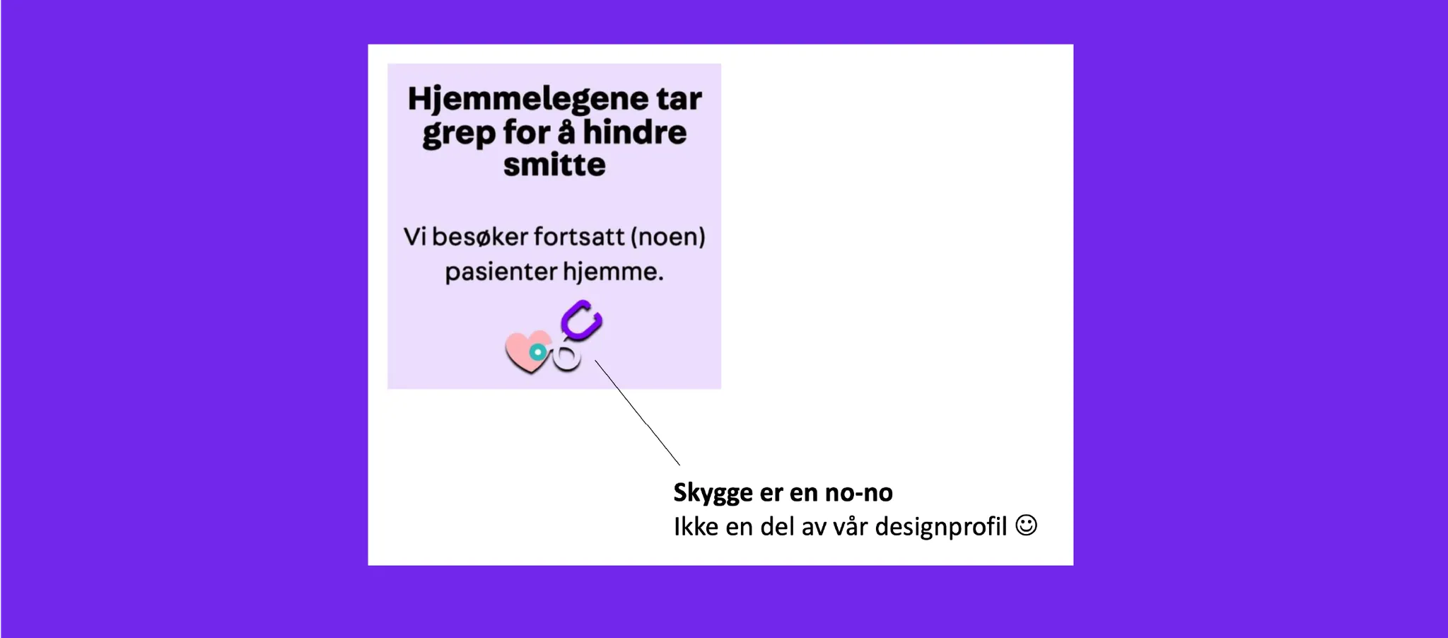
- No shading
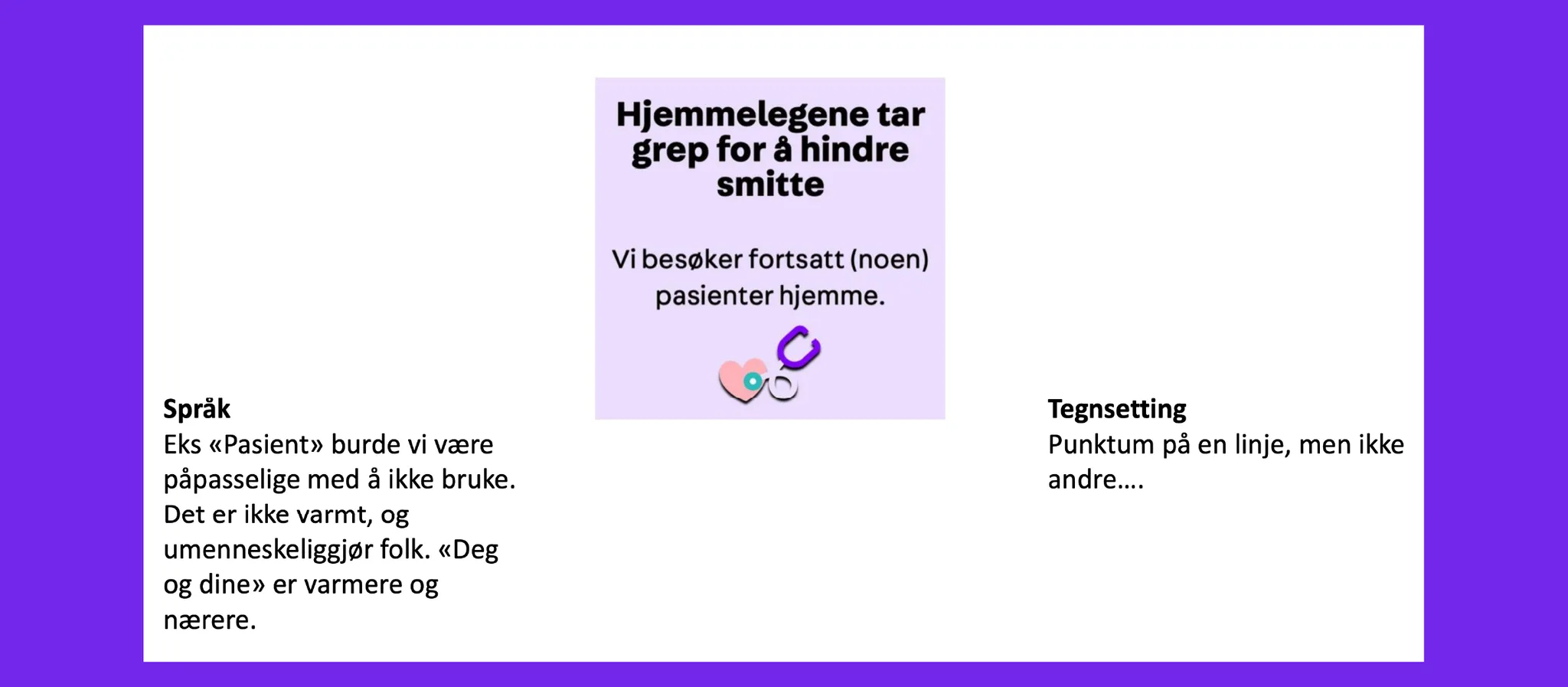
- Language should always be friendly, close warm and safe. Make it simple!
- Punctuation: Logical consistent
- Do not have sharp edges always rounded (for buttons and graphical shapes)
